
This has appeared recently on both BoingBoing and MetaFilter, and I can’t imagine anyone reading this doesn’t read one, if not both, of those sites… but what the hell. It hasn’t stopped me yet.
It’s the design document for Pepsi’s new logo change. Basically, the report that the graphic designers sent to Pepsi, saying “Here’s what we came up with and here’s why it’s awesome.”
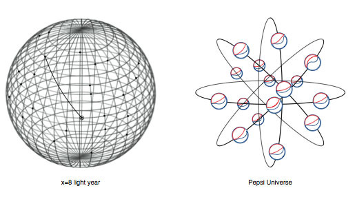
It is the most blitheringly insane pile of Timecube-esque nonsense ever.
The interesting question is, though: is it bullshit, or did the designer actually believe what they were spewing? And though I’m leaning towards “bullshit”, I do have a degree in graphic design, and I have met people who honestly did believe their insane justifications for why they designed things they way they did.
Regardless of whether it’s bullshit or not, though, you shouldn’t villify these designers for writing it. (Villify them for the actual logo design being crap, if you like.) The reality of the design world is, you can’t just say “I made this coz I think it looks nice”; you don’t get paid that way. 99% of people who buy designs don’t understand why they’re paying money for it; “My 14-year-old nephew spends all his time drawing,” they think, “and I could pay him with comic books.” You hear it about modern (non-commercial) art too: “My kid could do that!”
The fact is, it takes talent, experience and (unless you luck out and hit an excellent idea on the first go) hard work to come up with a design that looks right and will be effective, distinctive, and eye-catching, but it’s not always easy to quantify why it’s good; often it’s a “you know it when you see it” kind of thing. But, the people who shell out the money for the designs need to be convinced that they’re getting something for their money, so the artists have to come up with elaborate justifications for what they’ve done, often involving the word ‘synergy’. Hilarity ensues.
